Snarking the mayoral race: Bad design = bad democracy
Editor's note: We don't usually run opinion pieces written by people we don't know, but in this case, designer Michael Collett's snarky take on the typography and design elements of the logos used by our mayoral candidates (official, unofficial and those who've withdrawn from the race) is a reminder that there is no wider target for satire than political figures — no matter how locally admired. We don't necessarily share Collett's opinions, but we did enjoy his fresh and unusual perspective.
Editor's note: We don't usually run opinion pieces written by people we don't know, but in this case, designer Michael Collett's snarky take on the typography and design elements of the logos used by our mayoral candidates (official, unofficial and those who've withdrawn from the race) is a reminder that there is no wider target for satire than political figures — no matter how locally admired. We don't necessarily share Collett's opinions, but we did enjoy his fresh and unusual perspective.
On Thursday, Jan. 15, while on hold for 15 minutes with Healthcare.gov customer service, I sat on Twitter and watched Nelson Diaz, one of a number of popularly assumed, if not yet declared, Democratic candidates for Mayor of Philadelphia announce his intent to run, via the Twitter account of AL DÍA.

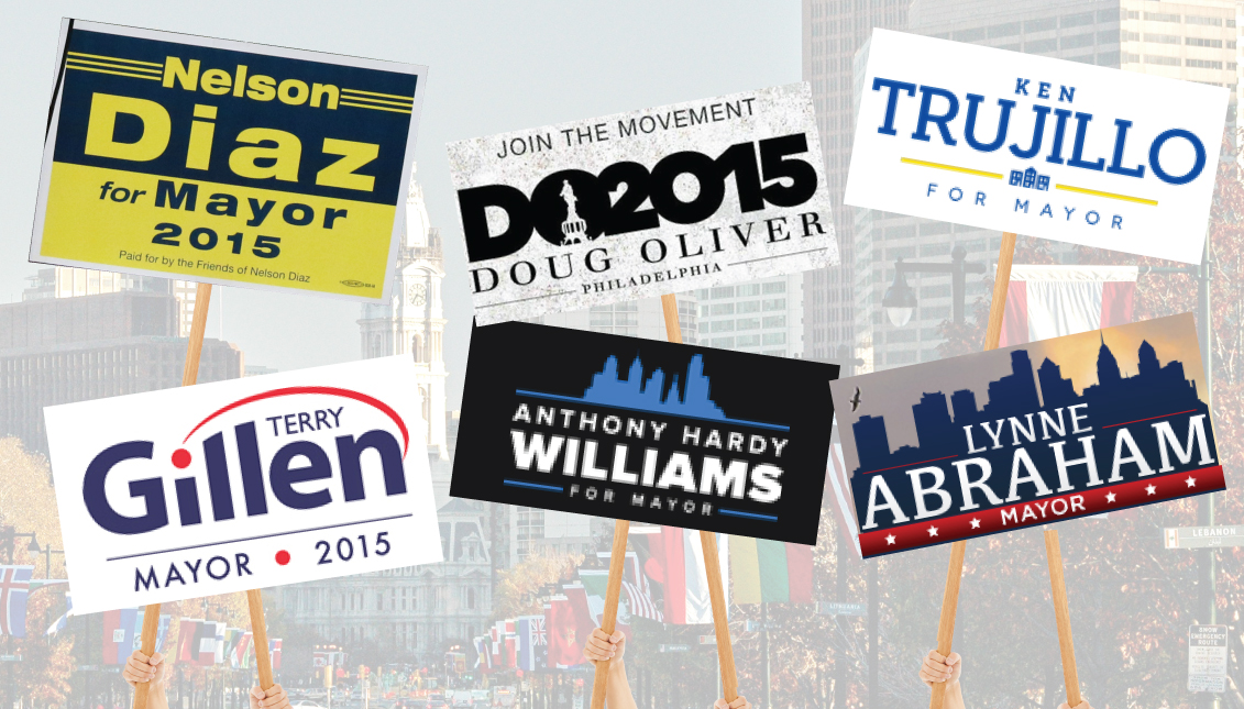
When I saw Candidate Diaz’s placard, executed in a typography so cliché as to be effectively invisible, I had to know what the other candidates for the highest office in the nation’s fifth largest city were (or weren't) doing about their communications.
But first, a little background
I’m not a native Philadelphian. I’ve lived here for four years and am still registered to vote in, carry a drivers license from, and fly the flag of the great state of California. Don’t get me wrong, I love Philly, but I’m just loyal.
Which is to say, I don’t have a dog in this fight for mayor.
That said, one of the things I particularly love about Philly is its home-grown typography, the best examples of which can be found on antique signs and hand-painted windows in the unreconstructed parts of town.

Proud, strong type, whether in ink or steel, somehow utilitarian and refined at the same time. It’s as if the whole city was a butcher’s menu of entrails, written in a fat sans serif, in 18k gold, on glass.
Philly politicians, however, spurn the city’s (graphic) riches
Philadelphia is a city where the voter turnout for the Mayoral ballot dropped below 30 percent in the last election. In the age of Post-Obama, where we've seen just how potent a well thought-out and coordinated political campaign can be, one would think big-city mayoral candidates would have the foresight to pay their design some mind — or at least hire someone to pay attention. But as I quickly found out, this is not the case.
To wit, and in no particular order

lynneabraham.com
Lynne Abraham, Philadelphia’s former District Attorney, promises “to make our home the Next Great American City." This (design) is right out of a Lifetime movie art department drawer; the classic politician template of Skyline + Small First Name + Big Last Name. Geared, no doubt, to the same crowd that shares her prehistoric views on cannabis.
Also, unless I’m mistaken, her campaign team have forgotten to include City Hall in their skyline, which is either a hilarious blunder or a sobering (albeit Freudian) admission of where her priorities lie.

Now withdrawn from the mayoral race, self-made man Ken Trujillo was going for the gentrifier vote. He’d managed to avoid doing the WHOLE skyline, opting instead for the out-of-scale-with-the-rest-of-the-neighborhood, 10-year-tax-abatement row home we can assume his constituency lives in.
The slab-serif surname has a strange, prefab militarism to it that only highlights that there was a notorious Dominican dictator with the same surname. The sloppy first name, spaced too wide and differently than from “For Mayor” — truly, the banality of hipness.

anthonyhwilliams.com
Remind you of something? Does the name seem familiar? It should, Anthony H. Williams is the son of a politician. Ironically, for a guy who infamously bait-and-switched his way into office with his dad, it certainly seems like he’s been sold a bill of goods with his logo.
What galls me so much about the skyline trope is you just know someone did this in Image Trace and billed for two hours of drawing. And why go through the trouble of finding a font that is essentially Helvetica, but so obviously not Helvetica?

nelsondiazformayor.com
Nelson Díaz, the late entrant who set me down this sloppily-typeset rabbit hole, runs away with the Miss Congeniality award in this foul pageant. Talk about can’t-be-bothered. Díaz doesn’t even have a working website, so the only graphic his campaign has is his announcement placard. It’s a shame, too. As individual letterforms, there’s a muscular economy to them, and in the corner of the posters, there’s the union printers insignia, so at least the folks making it got a fair wage.
But there is just a strange resignation to the design and its implementation; the candidate hasn’t posted it to his Twitter, and even his parents seem kind of disappointed by its resolute middle-of-the-road-ery.

do2015.com
Still "unofficially" a candidate, Doug Oliver, who jumped from the Mayor’s Office to the privatized city gas company, and from the Republican to Democratic ticket to run for mayor, avoids some of the obvious politician logo pitfalls, and attempts something out of the ordinary. It suffers most obviously, though, from being clearly unfinished.
At best, it’s a five-minute typography sketch, the kind a designer makes seven of to show a client early on in the process. There’s an idea here, maybe not a great one, and it’s far from polished. But as a final product? The sloppy William Penn silhouette, mashed-up 2015 and distracting, stretched-Didot "U" all conspire to sweep this one into the bin.

terrygillen.com
Another candidate who has withdrawn from the race, Terry Gillen, like Oliver, has managed to skirt the city skyline/bricks and mortar clichés of the rest of the field. That she didn’t fall into quite the same holes, though, is all there really is to say for this one. The hierarchy of the names makes it read like “Gil ‘n Terry”, which sounds more like a country-rock shock jock morning show than a mayor.
Graphically, she comes to the proverbial knife fight armed with, well, PetSmart. I also can’t stop looking at the off-balance spacing of the dividing line and just like Williams, we’ve got another terminal case of sans-serif anonyma ill-advisus.
It’s generally great — unless you're trying to find a job — but what it means for politicians is that more and more people can read the fact that you don’t give a damn, especially when you literally put your name on it.
And let’s be clear, that’s exactly what each of these logos say.


LEAVE A COMMENT: